I think because I have minimized the amount of interactions, adding sound as an extra element would be perfect in creating the fun, silly theme I have for my game.
To apply to my underwater theme the sounds I have chosen are a background noise of a sort of submerged recording of lots of bubbles that will play quietly and constantly in my code to set the deep sea mood.
This is the source of the sound I am thinking about using:
http://www.freesound.org/people/digifishmusic/sounds/45521/
The other sound I want to use is to emphasize my main interaction which is the shrinking and re growing of the sea critters. To do this I want to incorporate a cute bubble popping kind of noise for when the critters pop back to full size.
Source to the sound I think I will use:
http://www.freesound.org/people/BMacZero/sounds/96125/
Hopefully sound will give more life to my application and my characters.
Showing posts with label P2. Show all posts
Showing posts with label P2. Show all posts
Monday, 15 October 2012

Thursday, 4 October 2012
5 Images of my Application
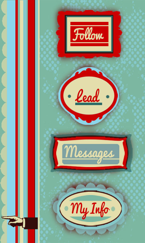
I also thought this was a good representation of the kind of style I have given my system, where everything is very simple but has a bit of flair to it.


 Finally, this is a close up map of the users location and other online users they could follow for directions. Although all my maps have a few issues with readability and clarity i think this one is definitely the easiest to follow and read, probably down to the simplicity and road names. All my maps could use some refining to make my app more user friendly.

This picture is from under my info setting and shows they kind of statistics that would be made avaliable to the viewer. I chose this shot as I think the my info part is one of the elements that makes app more than just a glorified gps, this gives a personal element to the whole system by showing how you can use the app for so much more than just getting directions.

I am particuarlly fond of the 'messages' element of my app because there is nothing more frustrating than trying to track down a tutor or lecturer at uni. Its one thing to try and find a static room let alone a mobile person. The messages function allows students to exchange information on the last known whereabouts of staff members. I also like that this almost serves as a reminder that this app is all about other people, its a interactive system.

This photo shows a map depicting the most popular route of the users direction request. This is what the user is given is no live 'guide' is going the same way to provide live directions. This shows how the app has back up options and alternatives. I have tried to spend alot of time thinking of all scenarios that could occur with this app and coming up with solutions such as this.

200 words describing my app
‘Find and Follow’
My navigation system centers around the idea of multiple users all logged in to one app to help each other find their way around. Essentially users can play two roles; follower or guide. The follower logs in with their current and desired location and the app finds guides (other users) who have logged in that they are going the same way. The app then tracks the guide’s phones in order to presents the follower with a map that allows them to literally follow the guides footsteps. Using real time and real life people to give direction allows for the best possible change of avoiding unexpected obstacles that can occur, such as construction. If no one is going to the desired location of the follower at that moment in time, they are given an alternative map showing the most popular route taken to that location over the past 10 days giving them the next best chance of avoiding obstacles. If the user wishes to find a staff member such as a tutor or lecturer (rather than a specific location) there is the ‘message’ option where users can ask or answer text-like messages about peoples whereabouts. As incentive to log in as a guide where you are providing the service rather using it, there is a points system that awards you for every trip you make. This also brings in a fun, competitive element between the other users as there is a public leader board of who has the most points. Every user can be both a follower and a guide they do not always have to log in as one or the other. A ‘my info’ page that displays the users total points, number of trips made, average time it takes to walk 500m etc to allow the user to keep track of progress within the app.
Friday, 28 September 2012
More Style Development

(unfortunately stretched)
This is a screen shot of a development in style I tired using the pictures I found as a loose precedent. Using 'old fashioned' transport as symbols within my design was an idea I considered as the app is about travelling from one place to another however I decided there would probably be enough going on in each frame without using pictures that aren't strictly necessary. I also gave more 'grundgy' layering a go but decided it was to all over the show and un-purposeful. Although I dont want my end design to look crisp and structured I still want it to serve the purpose of highlighting the point of the application.

This is the final style and colour pallet i have decided on to use for my whole flash application. ( I love the way it has a slight circus reference to it - a very people orientated event!) I am happy with the colour pallet choice as I think it is attention grabbing but not because it is overly loud or because it clashes. I also like that it doesn't appear to femminne, which was always a concern of mine as I find my work often appears very obviously female. Because this app is aimed at students I am most happy with how, is this title page is anything to judge off, my app appears fun and easy to use which is all anyone really wants.
Tuesday, 25 September 2012
Interim Advice and Reflection
I got some great feedback from the interim presentation that should definitely help with development of my idea. One of the best ideas was to further develop my idea of using a points system as an incentive to make people providing the directions rather than following them log on and allow their phones to be tracked. It was mentioned that I could somehow make them relate to vic plus awards which would definitely be a great idea to look into.
Other ideas were to add features such as timers or counters that measure the approx distance your journey will be and the approx it time it should take you. I think this is an excellent way to add more elements into my design.
Finally, the design and style of my design seemed to be liked for its playfulness and almost cartoonish characteristics making it seem fun and lively, however I should try out a few styles before I committ to one as hand drawn and digital translate very differently.
Developing Style
This is mock up of what the style of my app would appear like if i stuck to the trend and colour scheme I used in my interim wire frame mock up. Orignially I really like this style for the bright coulours, simplicity and the way it catches your eye however I think I prefered it for my interim as the hand done look it better suited the colours than the perfect rectangles and straight lines that are created when it is translated into digital form, it is to static and I want my design to appear lively and liked through more than a bright colour scheme which is what would happen here.

Colour Scheme and Influence
These are a couple of pictures of images I found on google that represent the kind of STYLE i am now looking to use. The slightly vintage, brightly coloured, flat but layered graphic design is perfect bring an extra element to my interface. I think this style is fun and eye catching because of the colours but also has a simplistic element to it that would makes it very flexible end would be able to be used across a whole range of elements that would come with an navigation app, all the way from menus to maps.
Although I would make some adjustment, I also like many elements of both the colour schemes in these photos, the contrast between pale browns and creme with bright blues and reds creates an aesthetic of livelyness that cannot be ignored - as the main focus of my app is that it relies on live people, it is really important to me to capture a sense of life and movement within my design - I want to go in the complete opposite direction to the setrile 'grey' nature modern technology often has.


Monday, 24 September 2012
Interim Wire Frame Diagram
This is my wire diagram representing my navigation system. Developing on my idea of following other people to find places I have produced four main tasks that the app will involved;
Follow - in this setting you are able to log in you location and destination and the app will find you other users who are going the same way you are able to follow through tracking their phones. (represented in red on diagram)
Lead - this is when you log in your location and destination to allow other users to track your phone and follow in your footsteps (you are expected to know where you are going to use this setting)
(represented in orange on digram)
Messages - this is my solution to when the desired destination is actually a person rather than room/ building/startionary object. In this setting you are able to send messages to other users asking if they know anything of the persons whereabouts. Message will be sent to all users who all have the option to either reply or delete.
(represented in purple on diagram)
My Status - this is setting is where all your statistics, action within the app etc are stored. It lets you know how many trips you have main, your average time over 500m and so on, this is the personal part of the app.
(represented in blue)

Tuesday, 18 September 2012
Concepts
With the up and coming interim I am starting to narrow down on a few concepts that I think I could work with to develop into a full idea.
The two I am thinking about at the moment are:
1. Using vibrations from a phone (or possible futuristic device) that guides the user through speed or rhythm into going the right way - this concept has come about from the idea that people dont like to appear they are lost or dont know their way. Often people will refuse to ask for directions or even admit they are lost all it an be seen as an embarrassment. Using vibrations from an everyday object such as a phone or ipod is a way for people to be subtly getting directions without appearing to be lost (ie they will not need to be staring at a map or have an unusual piece of equipment on them). The downside of this idea is that it could be very hard to make it clear what it wanted using only vibrations, there is only so much you can do with them.
2. My second idea is loosely based on the iphone app 'Find a Friend' where users add friends to their profile meaning they can then trace where there friends are through their phone and 'find' each other.
I am thinking about a creating something along these lines where users phones are traced so people can use them to get directions if they are going to the same place. It would be completely annoymous (to avoid any claims of the app having a 'stalker'-like nature) but would be a perfect way to avoid unexpected road blocks as a live person is the best way of knowing if something is in the way. This idea would need some serious development and refinement to work out issues such as why people would offer to let people track their phones? however I like that it is a simple idea with ALOT of potential
The two I am thinking about at the moment are:
1. Using vibrations from a phone (or possible futuristic device) that guides the user through speed or rhythm into going the right way - this concept has come about from the idea that people dont like to appear they are lost or dont know their way. Often people will refuse to ask for directions or even admit they are lost all it an be seen as an embarrassment. Using vibrations from an everyday object such as a phone or ipod is a way for people to be subtly getting directions without appearing to be lost (ie they will not need to be staring at a map or have an unusual piece of equipment on them). The downside of this idea is that it could be very hard to make it clear what it wanted using only vibrations, there is only so much you can do with them.
2. My second idea is loosely based on the iphone app 'Find a Friend' where users add friends to their profile meaning they can then trace where there friends are through their phone and 'find' each other.
I am thinking about a creating something along these lines where users phones are traced so people can use them to get directions if they are going to the same place. It would be completely annoymous (to avoid any claims of the app having a 'stalker'-like nature) but would be a perfect way to avoid unexpected road blocks as a live person is the best way of knowing if something is in the way. This idea would need some serious development and refinement to work out issues such as why people would offer to let people track their phones? however I like that it is a simple idea with ALOT of potential
Monday, 17 September 2012
Kelburn Scavenger Hunt
After the room/piano hunt we went on around Kelburn it is clear that finding rooms you have no idea about location wise is a lot lot harder than you would expect, where you would think it would mostly just be logic you can never be to sure, room 15 in the hunter building was accesible only through room 19 with nothing but a note the size of a post it to let you know.
It is also interesting how much of a difference having a vague idea of somethings whereabouts is than not having a clue. It would possibly be a way to look at this project from the different points of view of each as the level of instructions and detail needed in describing a locations whereabouts is significantly less if you have some idea where you may be heading.
It was also hard trying to write down and describe the directions we took to get places. Having to explain things like a slight turn or which door to walk through proved a lot harder than I thought it will be. Even reading back over the instructions we wrote they seemed very vague and unhelpful. This will definitely be something to keep in mind when designing my interface, clarity and being specific in directions.
It is also interesting how much of a difference having a vague idea of somethings whereabouts is than not having a clue. It would possibly be a way to look at this project from the different points of view of each as the level of instructions and detail needed in describing a locations whereabouts is significantly less if you have some idea where you may be heading.
It was also hard trying to write down and describe the directions we took to get places. Having to explain things like a slight turn or which door to walk through proved a lot harder than I thought it will be. Even reading back over the instructions we wrote they seemed very vague and unhelpful. This will definitely be something to keep in mind when designing my interface, clarity and being specific in directions.
Friday, 14 September 2012
Group Discussions
Some great points were bought up in tutorial while having a group discussion to try and generate some solid ideas preparing for the interim,
As always the ever present question of what do you do if you reach a road block/ how do you avoid road blocks?
Personally I think this is a huge issue that need addressing in order to separate from a standard GPS or computer system that cant think for itself. How can my app offer different options when the user comes to a road block or better yet, how can it avoid the road block in the first place before it becomes an issue?
Can multipul people use your app/technology at the same time?
i.e cannot light up a building as a way of showing somewhere where to go HOWEVER you can give them technology that lights up the building for their eyes only such a pair of glasses. This is a perfect example of how the most outrages ideas can be made into reality thriugh refinement.
Personally I want to design an app that works for multipul users and as general a group as possibly, ie. at this stage I am not looking at doing anything designe for a specific target audience, eg just females or males.
This tut really made me broaden my thinking of this project to include ideas such as does the app/technology have to be something you operation through your hands or can it be smell, or sound based, the more creative the better!
I now need to start generating/ developing 2-3 solid ideas to find my final one.
As always the ever present question of what do you do if you reach a road block/ how do you avoid road blocks?
Personally I think this is a huge issue that need addressing in order to separate from a standard GPS or computer system that cant think for itself. How can my app offer different options when the user comes to a road block or better yet, how can it avoid the road block in the first place before it becomes an issue?
Can multipul people use your app/technology at the same time?
i.e cannot light up a building as a way of showing somewhere where to go HOWEVER you can give them technology that lights up the building for their eyes only such a pair of glasses. This is a perfect example of how the most outrages ideas can be made into reality thriugh refinement.
Personally I want to design an app that works for multipul users and as general a group as possibly, ie. at this stage I am not looking at doing anything designe for a specific target audience, eg just females or males.
This tut really made me broaden my thinking of this project to include ideas such as does the app/technology have to be something you operation through your hands or can it be smell, or sound based, the more creative the better!
I now need to start generating/ developing 2-3 solid ideas to find my final one.
Friday, 24 August 2012
Notes on pictures/screen shots
Unfortunately images put it the setting 'original size' will not show up on the actual blog post so all the screen shots I have used on my blog are slightly stretched as it is the only way they will show up.
Thursday, 23 August 2012
Final Image

This is my final 4 panel all placed together showing the change from structure to noise. My idea is based on the concept of looking at something under a microscope. This is what has inspired my colour pallette as i wanted it to look cold and sterile and artificial (like its in a laboratory). I have also used this idea to inspire how across the board it is as though the 'object' is being more and more zoomed in on as more details can be seen but the form starts to be lost. My form is made by having layers and layers of circles drawn by circles then adjusting the variables like width, height and amount of small circles in each big circle etc
Wednesday, 22 August 2012
Playing with Size
Below is a picture of my final pannel where the only thing i have adjusted is the width and height of the BIG circles (that are made up by the little ones) so that all the layers of circles are the same size. I think it is amazing what a difference it makes, how my 'noise' panel can instantly be turned back into structure with such a straightforward adjustment.


Playing with Stroke
I have experimented with my almost finalized panels by adding a stroke to the outside of some of the circles. I have done this to see what it adds to my design and see if it builds upon the texture or detracts from it.


PANNEL 1 - STROKE

NO STROKE

PANNEL 2 - STROKE

NO STROKE

PANEL 3 - STROKE

NO STROKE

PANEL 4 - STROKE

NO STROKE

This is probably the only panel i am sure that i prefer the stroke on rather than off, without is the background become blurry and appears almost pixelated, the stroke helps to add depth and layering to the 'chaos' emphasizing the idea of structure and noise.
I also like how it fits the idea the 'microscope' zooming in closer to the form so we start to see more detail (i.e the outline of the shapes) but at the same time the symmetrical structure starts to become lost.
I think i would like to slowly bring in a stoke across my panels to build up more of a contrast between pannel one and pannel 4.
Playing with Colour
Although I am happy with my colour choices I thought I should experiment using different colours incase I found that one really jumped out at me and to see what kind of a difference the colour palette brings to my design...


The green above and red directly below are variations on my 1st pannel which is currently a blue/purple colour. I found with both of these that they didnt capture the same mood as the original blue did. They dont have the distant, coldness that the blue does which i am trying to capture - these colours are much more in your face compared to the subtleness of the blue.


Below is my current final for my 2nd panel, above is an experimentation i did swaping the black background for a white one. Personally i think it lacks the intensity and depth of the black background, I prefer how the black works with the design rather than contrasts against it like the white does.

This red variation below was just me mucking around with changing colour and background, it is not something i think i need to keep developing, the colour experimenting has just made me appreciate my original colour choice more.

Playing with shapes
This was just a bit of experimenting I thought I would do once i had pretty much got my final panels down, i created it by replacing the circles with rectangles just to see what kind of effect it would produce. Below are shots of my 1st panel and 4th panel only.
To stick with my inspiration of looking through a microscope i definately think the rectangles de-tract from the idea of it being some sort of organism/cellular make up under a micro scope, the oragnic feel is lost and instead reminds me of pixels/electronics. The second image definately looks better with circles as the squares just makes it appear to be very blurry and pixelated.


Tuesday, 21 August 2012
More Development

Developing

This is a picture of me experimenting with creating lattices out of circles, i want to try experiment with the 'random' colour function to try and give the design some more depth as the moment it looks very basic and boring, i think mixing up the colour will also help to start break up the structure
Monday, 20 August 2012
Colour Scheme
Now that i have finalized my precedent and am starting work on how the design of my 4 panels i am starting to finalize my colour scheme although i will keep tweaking it to see what looks best, this is the kind of pallet im thinking about using..
 I am aiming to work with a cold, un natural looking pallet.

Subscribe to:
Posts (Atom)