Wednesday, 31 October 2012
Thursday, 25 October 2012
Settings
This is an example of the kind of setting I want my character to walk along on her journey from te aro to kelburn, the setting will be simple but different so she is obviously walking forwards to something. I also wil make them all static so the girl is the only thing moving on the settings making her walk more obvious


My character
I wanted to make the characters I use in my film have a quriky slightly alice in wonderland theme to them to make the kind of theme that my app has.
 This is a picture of my two main characters. I wanted the helper character (the boy) who gives the girl the app to appear as if he could be a student but with a few quirks about him that make him seem unusual - the giant bowtie and hat

Tuesday, 23 October 2012
Painting on people
To develop my idea to draw on live people further i decided to paint my app onto them as well. My film zooms into to show what is happening on the screen of the iphone, this is when the painted people are used. I decided to paint them because my app is made by using real people to show the way, and by making people physically become the app it is literally made by real people.


Here is an example of one of the painted people and the original picture of my app. obviously the people will be simplified as it is very difficult to paint on people!
I also wanted to paint on people to keep my style consistant throughout my app, if i zoomed in and used my original photoshop version I feel as though it is not organic enough to be used with my hand drawn animation
Thursday, 18 October 2012
Final Mouse Toy
These are screen shots from my final code. I a very happy with how it has turned out, I like that it is simple but still engaging and has a very distinct fun/cute vibe to it that attracts the audience to play.
As a whole I think the combination of the simplicity of the interactions, the sound effects, graphics and ideas behind my game create a fun, very easy to use and highly highly addictive application which is exactly the kind of results I was looking to get out of my game.
In one of the first lectures we were asked to consider what the user will learn from our game and if it will still be fun to use once they have learnt it or does it quickly become repetitive and boring? I constantly asked myself this throughout the designing process to make sure that my game kept the user entertained for more than ten seconds.
I think that although it comes clear quite quickly everything my game has to offer, the variation in the interaction (never knowing when they will pop back to full size or what direction the critters will go in) and the fact that it is impossible to get them all small at the same time keeps the user entertained and addicted and it is easy to become mesmerized and keep playing without even really realizing!


BIG development
The main thing i didnt like about my idea for the interim storyboard is how I felt it wasn't pushing the boundaries enough, it was to predictable of the style of app i was using that I would go down the animated hand drawn route. To try and break out of the molde i saw myself in I tried to think what it was that most made my app unique, which i concluded was how it relise of the use of other live people, and how could i apply this idea to my film to tie them together.
The idea that came to me was that I wanted to make my film so that is also had a reliance on live people, thus sprang the decision to use real people as the canvas for my film rather than paper. I would hand draw a stop motion animation but make it come to life by drawing it on real people torsos and arms.
The idea that came to me was that I wanted to make my film so that is also had a reliance on live people, thus sprang the decision to use real people as the canvas for my film rather than paper. I would hand draw a stop motion animation but make it come to life by drawing it on real people torsos and arms.
Tuesday, 16 October 2012
Interim Presentation

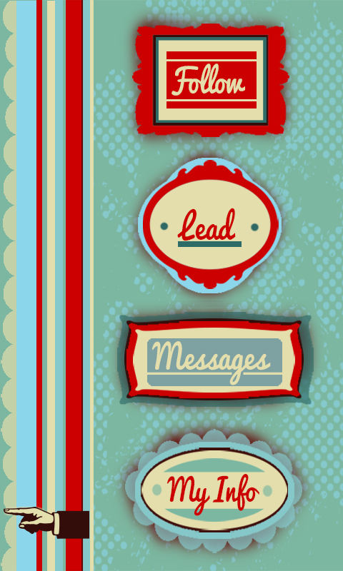
Although my storyboard/idea only shows one of the features of my app, because it is the main one and the others features such as the 'lead' and 'messages' options are very similar and branch off the same concept, i think it is acceptable that not everything is shown.
Monday, 15 October 2012
Adding Sound
I think because I have minimized the amount of interactions, adding sound as an extra element would be perfect in creating the fun, silly theme I have for my game.
To apply to my underwater theme the sounds I have chosen are a background noise of a sort of submerged recording of lots of bubbles that will play quietly and constantly in my code to set the deep sea mood.
This is the source of the sound I am thinking about using:
http://www.freesound.org/people/digifishmusic/sounds/45521/
The other sound I want to use is to emphasize my main interaction which is the shrinking and re growing of the sea critters. To do this I want to incorporate a cute bubble popping kind of noise for when the critters pop back to full size.
Source to the sound I think I will use:
http://www.freesound.org/people/BMacZero/sounds/96125/
Hopefully sound will give more life to my application and my characters.
Thursday, 4 October 2012
Symbols and Sound

This is a screen shot of some of the symbols I am using in my design, the feet and hands replace dots and arrows. I have made this decision because (as i have mentioned before) the main idea of my interface is live/real people. Using little things like hands and feet help to emphasize this point and also fit nicely into the style of my screens.
Unfortunately I couldn't get sound to end up working on my final flash application (though not from lack of trying) which was a real shame as for a small time I had the classic human crowd "ooooo's" and "aaaaaaaah's" going along with the clicking of some of my buttons to give it yet another element of being an application full of life.
5 Images of my Application
I also thought this was a good representation of the kind of style I have given my system, where everything is very simple but has a bit of flair to it.


 Finally, this is a close up map of the users location and other online users they could follow for directions. Although all my maps have a few issues with readability and clarity i think this one is definitely the easiest to follow and read, probably down to the simplicity and road names. All my maps could use some refining to make my app more user friendly.

This picture is from under my info setting and shows they kind of statistics that would be made avaliable to the viewer. I chose this shot as I think the my info part is one of the elements that makes app more than just a glorified gps, this gives a personal element to the whole system by showing how you can use the app for so much more than just getting directions.

I am particuarlly fond of the 'messages' element of my app because there is nothing more frustrating than trying to track down a tutor or lecturer at uni. Its one thing to try and find a static room let alone a mobile person. The messages function allows students to exchange information on the last known whereabouts of staff members. I also like that this almost serves as a reminder that this app is all about other people, its a interactive system.

This photo shows a map depicting the most popular route of the users direction request. This is what the user is given is no live 'guide' is going the same way to provide live directions. This shows how the app has back up options and alternatives. I have tried to spend alot of time thinking of all scenarios that could occur with this app and coming up with solutions such as this.

200 words describing my app
‘Find and Follow’
My navigation system centers around the idea of multiple users all logged in to one app to help each other find their way around. Essentially users can play two roles; follower or guide. The follower logs in with their current and desired location and the app finds guides (other users) who have logged in that they are going the same way. The app then tracks the guide’s phones in order to presents the follower with a map that allows them to literally follow the guides footsteps. Using real time and real life people to give direction allows for the best possible change of avoiding unexpected obstacles that can occur, such as construction. If no one is going to the desired location of the follower at that moment in time, they are given an alternative map showing the most popular route taken to that location over the past 10 days giving them the next best chance of avoiding obstacles. If the user wishes to find a staff member such as a tutor or lecturer (rather than a specific location) there is the ‘message’ option where users can ask or answer text-like messages about peoples whereabouts. As incentive to log in as a guide where you are providing the service rather using it, there is a points system that awards you for every trip you make. This also brings in a fun, competitive element between the other users as there is a public leader board of who has the most points. Every user can be both a follower and a guide they do not always have to log in as one or the other. A ‘my info’ page that displays the users total points, number of trips made, average time it takes to walk 500m etc to allow the user to keep track of progress within the app.
Monday, 1 October 2012
Adding Background
Finally got around to adding a photo background into my game, I had already decided on a underwater photo so all I had to do was import it into my code. This turned out to be more difficult that I thought as once the image was in the screen it froze up all the interaction for some reason however managed to get it fixed and love the way it looks, i think having a photo rather than a blue screen really brings about a much more realistic and interesting setting for my game to fill my under the sea aesthetic.


Subscribe to:
Comments (Atom)