Showing posts with label HAND_IN. Show all posts
Showing posts with label HAND_IN. Show all posts
Wednesday, 31 October 2012

Thursday, 18 October 2012
Final Mouse Toy
These are screen shots from my final code. I a very happy with how it has turned out, I like that it is simple but still engaging and has a very distinct fun/cute vibe to it that attracts the audience to play.
As a whole I think the combination of the simplicity of the interactions, the sound effects, graphics and ideas behind my game create a fun, very easy to use and highly highly addictive application which is exactly the kind of results I was looking to get out of my game.
In one of the first lectures we were asked to consider what the user will learn from our game and if it will still be fun to use once they have learnt it or does it quickly become repetitive and boring? I constantly asked myself this throughout the designing process to make sure that my game kept the user entertained for more than ten seconds.
I think that although it comes clear quite quickly everything my game has to offer, the variation in the interaction (never knowing when they will pop back to full size or what direction the critters will go in) and the fact that it is impossible to get them all small at the same time keeps the user entertained and addicted and it is easy to become mesmerized and keep playing without even really realizing!


Thursday, 4 October 2012
5 Images of my Application
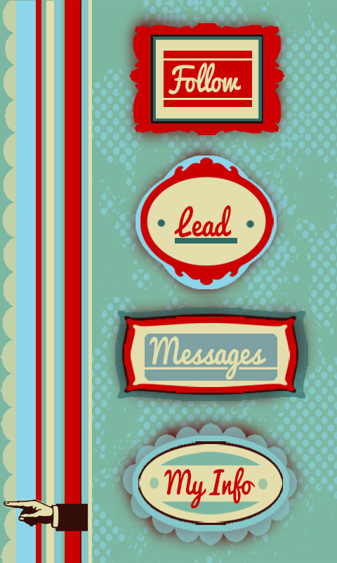
I also thought this was a good representation of the kind of style I have given my system, where everything is very simple but has a bit of flair to it.


 Finally, this is a close up map of the users location and other online users they could follow for directions. Although all my maps have a few issues with readability and clarity i think this one is definitely the easiest to follow and read, probably down to the simplicity and road names. All my maps could use some refining to make my app more user friendly.

This picture is from under my info setting and shows they kind of statistics that would be made avaliable to the viewer. I chose this shot as I think the my info part is one of the elements that makes app more than just a glorified gps, this gives a personal element to the whole system by showing how you can use the app for so much more than just getting directions.

I am particuarlly fond of the 'messages' element of my app because there is nothing more frustrating than trying to track down a tutor or lecturer at uni. Its one thing to try and find a static room let alone a mobile person. The messages function allows students to exchange information on the last known whereabouts of staff members. I also like that this almost serves as a reminder that this app is all about other people, its a interactive system.

This photo shows a map depicting the most popular route of the users direction request. This is what the user is given is no live 'guide' is going the same way to provide live directions. This shows how the app has back up options and alternatives. I have tried to spend alot of time thinking of all scenarios that could occur with this app and coming up with solutions such as this.

200 words describing my app
‘Find and Follow’
My navigation system centers around the idea of multiple users all logged in to one app to help each other find their way around. Essentially users can play two roles; follower or guide. The follower logs in with their current and desired location and the app finds guides (other users) who have logged in that they are going the same way. The app then tracks the guide’s phones in order to presents the follower with a map that allows them to literally follow the guides footsteps. Using real time and real life people to give direction allows for the best possible change of avoiding unexpected obstacles that can occur, such as construction. If no one is going to the desired location of the follower at that moment in time, they are given an alternative map showing the most popular route taken to that location over the past 10 days giving them the next best chance of avoiding obstacles. If the user wishes to find a staff member such as a tutor or lecturer (rather than a specific location) there is the ‘message’ option where users can ask or answer text-like messages about peoples whereabouts. As incentive to log in as a guide where you are providing the service rather using it, there is a points system that awards you for every trip you make. This also brings in a fun, competitive element between the other users as there is a public leader board of who has the most points. Every user can be both a follower and a guide they do not always have to log in as one or the other. A ‘my info’ page that displays the users total points, number of trips made, average time it takes to walk 500m etc to allow the user to keep track of progress within the app.
Thursday, 27 September 2012
Digital Application (photoshop storyboard)
Below is an example of what I want my sea critters to look like at full size and when sucked in..

Below is a basic example and diagram of one of the interactions I hope to achieve...

Below is a digital photoshopped image of a hypothetical screen shot of my application.

In this shot I have tried to incude a visual representation of all the interactions I hope to occur. In the lower left hand area is an example of a critter that has just exploded because the user has shaken on of the critters, creating many new small critters.
The arrow in the bottom left corner represents the curser, the fact that no critters are near by represents how they are repealed by the cursor.
The other critters around the screen are examples of critters at full size and fully sucked it.
The different colours used also represet that the colour will change randomly to one of the 6 designated colours when they bump into each other.
The background used in this shot is the same picture I hope to use in my code, I think it is effective at bringing the critters to life, it gives them a habitat.
Monday, 24 September 2012
Interim Wire Frame Diagram
This is my wire diagram representing my navigation system. Developing on my idea of following other people to find places I have produced four main tasks that the app will involved;
Follow - in this setting you are able to log in you location and destination and the app will find you other users who are going the same way you are able to follow through tracking their phones. (represented in red on diagram)
Lead - this is when you log in your location and destination to allow other users to track your phone and follow in your footsteps (you are expected to know where you are going to use this setting)
(represented in orange on digram)
Messages - this is my solution to when the desired destination is actually a person rather than room/ building/startionary object. In this setting you are able to send messages to other users asking if they know anything of the persons whereabouts. Message will be sent to all users who all have the option to either reply or delete.
(represented in purple on diagram)
My Status - this is setting is where all your statistics, action within the app etc are stored. It lets you know how many trips you have main, your average time over 500m and so on, this is the personal part of the app.
(represented in blue)

Thursday, 23 August 2012
Final Image

This is my final 4 panel all placed together showing the change from structure to noise. My idea is based on the concept of looking at something under a microscope. This is what has inspired my colour pallette as i wanted it to look cold and sterile and artificial (like its in a laboratory). I have also used this idea to inspire how across the board it is as though the 'object' is being more and more zoomed in on as more details can be seen but the form starts to be lost. My form is made by having layers and layers of circles drawn by circles then adjusting the variables like width, height and amount of small circles in each big circle etc
Sunday, 19 August 2012
200 Word Description - Final Product
Organic Oranges?
The main idea behind my project is the idea of combining natural elements with man made ones. My project takes an ordinary organic object (an orange) and breaks down all the individual properties that together make it up. I have then recreated each of these properties using only artificial materials to create orange ‘segments’. The experience my object intends to give the user is the unexpectedness of finding man made creations within an organic form. The users sense of touch and sight are then engaged by the segments on this inside as they feel and look at each one to try and decide what property of the orange it could hold. Although there is technically a ‘correct’ answer to this it is more important that the user interoperates for themselves what each piece could mean to give them their own individual experience.
Instruction
My interactive object is focussed on touch and sight so users are welcome to feel and examine all aspects of my object.
To begin the experience users need to take the lid off the orange. Users are then free to pick up any of the seven inner segments. When the users is satisfied with their experience of the segments simply need to place them back into the orange skin half and return the other half as a lid (segments go in no particular order).
Final Project - Photographs
These are my final 8 photographs of my project, some show the interaction some show some interesting details and others just capture all the elements of my project together.


Sunday, 5 August 2012
Story Board and Proposal
Proposal:
My project is designed to focus on the senses of sight and touch.
The idea behind my project is to combined natural elements and man made features to make an unexpected experience for the user. To achieve this I have taken the idea of using an orange to represent the natural feature but cutting it in half and hollowing it out so all that is left is the skin that forms the 'shell' for my project.
The unexpected experience comes when the orange is opened up and at first appears to be a regular orange made up of fruit segments but on closer inspection it become apparent that the insides are actually all artificial and man made. Each segment will then take this idea further by breaking down the combined properties that make up an orange into individual elements so that each segment represents a specific quality the orange has, however it will be re created out of man made features. For example one of the segments will be focussed on the weight of the orange so rather than weigh what one piece normally weighs, the segment will weigh the same weight as the orange as a whole and will be made out of artificial materials such as wood, plastic, card and metal. Other ideas I will explore for the other segments are the ideas of peeling back layers and how it is easier on some oranges than others, the squishiness of orange pieces, how the segments are not hollow but also not fully liquid inside and the idea of texture and how the pulp of the orange is soft and gets stuck under your fingernails.
The experience I want to give the user is how you can break down all the elements of a natural object and re create these using man made objects, creating an artificial experience of something that is so everyday and ordinary.
This is my story board to accompany my proposal...

Represents HOW my project works...
Thursday, 2 August 2012
Final Adaptable Form Layout

This is my final board of 5 sequences from one adaptable form (top right corner). As well as having each individual sequence show the process of how the form is adapted, I have tried to link my whole board together as one to make it like one piece of 25, not just 5 pieces of 5. I have done this by increasing the line weight over time. I have also tired to keep some balance in my board by avoiding the temptation to make every sequence end with the shape coming neatly together, instead in my last 2 sequences I make my shape 'blow up' to appear larger and less contained at the end.
Monday, 18 June 2012
Blog Post - My Standpoint
In my design I want to express my viewpoint by having the history of design re created out of sculptures made from the pages of books. Using the knowledge I have learnt from the 171 design lectures each of the sculptures will be somehow be significant to the design eras we have studied starting from the Greek Parthenon to the digital era of technology such as ipods and phones that we live in today and a sculpture to represent the future to show that history, like technology is constantly growing and developing. I also want to hint at the idea that the digital era we live in is distracting us from the importance of history by making us focus to much on the future. To show this I want to incorporate a person who is distracted by technology (e.g. ipod or phone) and therefore leave the book which all the sculptures will come out of behind, however, to symbolise the greatness of history the person will then come back and retrieve the book to show they have remembered.
An example we looked at in class of how history has influenced design of today is the Parthenon verses the Iphone. This connection stretches from 400BC to today however the influence of the classical style of the parthenon on the Iphone is apparent in the simplicity, straight lines, and monochromatic color pallet. This is a prime example of why history is so vital to the survival of great design.
References:
Smythe, Michael. 2011. Random House Group. New Zealand By Design.Print


Sunday, 17 June 2012
Mindmaps


These are my group and individual mindmaps on cultural and context design brainstorming words and features that could help with inspiration of what to do for my stop motion film
Test Clip 2
https://vimeo.com/44222309
Here is another test clip showing my new
beginning – with the idea of a person leaving the book behind. After showing it
to my tutor and discussing it, we decided that it needs to be shortened – as the
main focus of the film needs to be on the actual sculptures themselves.
3 second Test Sample
https://vimeo.com/44222201
Final Stop Motion Video
https://vimeo.com/44221985
The link to my final stop motion video. I am pleased with the way it expresses my design statement of the importance of design history and how we should remember what an influence it has been on design today.
Sound sourced from freesfx.co.uk
freesfx, (2011) timelaps,
retrieved from: http://www.freesfx.co.uk/soundeffects/music-tracks/
Friday, 1 June 2012
Blog 5 - Locovisual

The Old Government Building, located on Lampton Quay, is a perfect example of a building that has been strongly influenced by neoclassical design. Built in 1876 it now houses the Victoria University Law Library in is southern wing. It is also well known for being one of the largest all wooden buildings in the world despite appearing to be made completely of stone.
The Government building was constructed during a time where the neoclassical style was very popular for large and important buildings as it was associated with politics, power and solidity. Classicism was the style specifically chosen for the Government building to “convey strength and stability in a young country undergoing rapid growth and change.” (http://www.doc.govt.nz/)
The Government Building was designed to appear powerful and functional to promote New Zealand’s confidence in the Governments ability to lead their Nation
It is easy to recognize the neoclassical influence on the Old Government Building as it incorporates the follow features used to describe the neoclassical aesthetic;
“simple, yet beautiful style with clean lines and subtle accents in the form of metal decorations or carvings. Classical architecture is also often built on a grand scale, with imposing columns and large arches to demonstrate the skills of the builders.” (http://www.wisegeek.com)
The symmetry of the building, monochromatic colour pallet and minimalism in the decoration forms the simplicity and rationality associated with classical design.
The use of coulombs and triangular roofs creates a direct association with the greek Parthenon, a design structure from the 5th Century B.C, that is considered the baseline for all neoclassical design. This shows how classicism was a style that was designed to be timeless rather than just a temporary trend, even today the Government Building still had the effect of appearing powerful and important. The choice of white as the colour for the Old Government Building would also of been influenced by the Parthenon as it suggests that it is made from marble which is what classical structures such as the Parthenon were made of.
The Government Building has now been standing in the neoclassical style for nearly 140 years.

The Parthenon, 2010

The Government Building, 1910
Bibliography:
First Image - Old Governement Building, Law Library Entrance,
Self Taken, May 2012
Department of Conservation (2011), Historic Government Buildings, History of the Government Buildings
Retrieved from:
http://www.doc.govt.nz/conservation/historic/by-region/wellington-kapiti/wellington/government-buildings/history/ on 29st May 2012
WiseGeek (2012), What is Classical Architecture?
Retrieved From:
http://www.wisegeek.com/what-is-classical-architecture.htm on 29th May 2012
WondersTube (2010) The Parthenon, Greece
Retrieved from:
http://wonderstube.com/world-wonders/forgotten-medeival-mind-world/105-forgotten-medeival-mind-world-wonders-the.html on 31st May 2012
H. Plimmer (1910) Government Buildings, Wellington
Retrieved From:
http://www.wcl.govt.nz/heritage/architecture.html on 31st May 2012
Wednesday, 30 May 2012
Group Work - Advertisement for 101
http://vimeo.com/43095752
The intention of our film is to advertise a product developed by our athletic equipment company ‘KASI’ to show the kind of commodity our company creates.
‘Chubbatub’ is the specific product we used, it is a cream for chaffing that is targeted at athletes and chaffing specifically caused by vigorous workouts.
The ad begins with a clip of someone doing an intense work out, topped with a voice over explaining the situation. This is so the audience straight away knows that the advertisement is going to relate somehow to exercise.
The voice over uses rhetorical questions to provoke audience into thinking whether or not they can relate to the situation.
We used athletic equipment advertisements and infomercials for products such as Proactive and The Ab Circle Pro as inspiration for our ad. In these examples they use real people to talk about their success stories of using the product.
As we only had 15 seconds we used this idea but condensed it down to have different people saying just the product name (Chubbatub) in an enthusiastic way as if they are ‘satisfied customers’. This is to convince the audience that the product is not only effective but also works for a wide range of people including both males and females.
The ad also includes pictures of the product twice to press upon the audience what it looks like so they will start to recognize the product/brand name if they see it in other places.
Our ad is designed for the audience to know what it is selling, be convinced that it works and they want/need it and how to go about getting it.
Group:
Molly (me)
Meg Brodie
Framina Labert
Friday, 11 May 2012
Blog 4 - Fluid Form
"Its not what you look at that matters, it's what you see." -Henry Thoreau
This model, crafted from copper wire and thread, is portraying the fluidity of organic form and the contrast between curves and straight lines when placed together. From whatever angle you look at it, what you see will always be slightly different.
One of the two precedents that influenced this piece is the idea of ink in water. More specifically, the fluid way the ink spreads in all directions but all begins from a single spot. This is recaptured in the model by all the thread and wire appearing to be pour out from both ends of the thin copper wire in the middle as if this is the single starting point and everything is spreading from this point.
The second precedent used as an influence is a section of a metal bridge. In particular the idea that straight lines can still create rhythm and flow despite the lack of curves like in the zig zag section between the bars of the bridge. This is shown in the model by the straight lines helping to add to the rhythm rather than detract break it up. This precedent also combines with the influence of the Arts and Crafts movement that occurred in England.
The way the bridge doesn’t try to hide the way it was crafted in any way, for example the rivets of all the bolts that hold it together are visible, was a very important trait of the arts and craft movement. This is captured by the model by the way all the construction of how it fits together is clearly visible and becomes features of the design.

References for precedents/Quote:
1. Quote by Henry David Thoreau
http://www.brainyquote.com/quotes/quotes/h/henrydavid106041.html
2.Black Ink in Water, sourced from:
http://footage.shutterstock.com/clip-1981705-stock-footage-black-ink-in-water.html

3. Section of Bridge, sourced from:
gallery.hd.org/_c/places-and-sights/_more2001/_more10/Australia-New-South-Wales-Sydney-Harbour-Bridge-steelwork-beams-open-construction-rivets-box-girders-curve-of-span-visible-mono-1-MB.jpg.html

This model, crafted from copper wire and thread, is portraying the fluidity of organic form and the contrast between curves and straight lines when placed together. From whatever angle you look at it, what you see will always be slightly different.
One of the two precedents that influenced this piece is the idea of ink in water. More specifically, the fluid way the ink spreads in all directions but all begins from a single spot. This is recaptured in the model by all the thread and wire appearing to be pour out from both ends of the thin copper wire in the middle as if this is the single starting point and everything is spreading from this point.
The second precedent used as an influence is a section of a metal bridge. In particular the idea that straight lines can still create rhythm and flow despite the lack of curves like in the zig zag section between the bars of the bridge. This is shown in the model by the straight lines helping to add to the rhythm rather than detract break it up. This precedent also combines with the influence of the Arts and Crafts movement that occurred in England.
The way the bridge doesn’t try to hide the way it was crafted in any way, for example the rivets of all the bolts that hold it together are visible, was a very important trait of the arts and craft movement. This is captured by the model by the way all the construction of how it fits together is clearly visible and becomes features of the design.

References for precedents/Quote:
1. Quote by Henry David Thoreau
http://www.brainyquote.com/quotes/quotes/h/henrydavid106041.html
2.Black Ink in Water, sourced from:
http://footage.shutterstock.com/clip-1981705-stock-footage-black-ink-in-water.html
3. Section of Bridge, sourced from:
gallery.hd.org/_c/places-and-sights/_more2001/_more10/Australia-New-South-Wales-Sydney-Harbour-Bridge-steelwork-beams-open-construction-rivets-box-girders-curve-of-span-visible-mono-1-MB.jpg.html

Subscribe to:
Posts (Atom)